Work About Contact [email protected]
Selfcare
Case Study — 2024

Replacing folders with a clinical dashboard.

Doctors were managing patient nutrition with printed charts and spreadsheets. I replaced that manual chaos with a structured, insight-driven platform — and built the brand from scratch.

Role UX/UI & Brand
Industry Healthcare / Nutrition
Timeline Live in 6 weeks
Selfcare dashboard Selfcare Platform
UX Strategy · Dashboard Design · Brand Identity
Scroll to explore

A manual system
holding doctors back.

When I joined Selfcare, their team of doctors was manually managing patient health and food intake using document folders, printed charts, and scattered spreadsheets. It wasn't just old-school — it was actively holding them back.

Data was fragmented, insights were missed, and scalability was impossible. My goal was to design a system that worked the way doctors think: simple, structured, and instantly insightful.

This meant not only designing a clean, functional dashboard, but also building a full brand identity and scalable design system from scratch — giving the platform a professional foundation ready for growth.

6wk
First usable version shipped
40%
Faster patient review time
100%
Doctor adoption in 2 weeks
0→1
Brand built from scratch

Designer, researcher, brand strategist.

01 — UX / UI Design
Dashboard Experience

Led the full UX design from architecture to high-fidelity mockups, focusing on clarity, speed, and zero-friction daily use by practicing doctors.

02 — Research
Interviews & Shadowing

Conducted 1-on-1 interviews with Selfcare's doctors and shadowed their daily intake and reporting workflows to uncover real friction points.

03 — Brand Strategy
Identity & Design System

Built Selfcare's brand from zero — logo, palette, typography — and delivered a full component library and style guide for developer handoff.

04 — System Thinking
Offline → Digital Mapping

Mapped every workflow from offline chaos to digital clarity, translating folder-based habits into a coherent, scalable product architecture.

Starting with
"what's slowing you down?"

I spent the first week deep in their world — observing, listening, and cataloguing every friction point before writing a single design rationale.

Research Process

01

Shadowed daily workflows and folder-sorting rituals to see exactly where time was being lost.

02

Reviewed Excel trackers and patient health notes — mapping where data lived and where it fell through the cracks.

03

Conducted 1-on-1 interviews with 3 doctors to surface hidden pain points and wishlist features.

04

Audited existing tools to understand why doctors had rejected them — and designed specifically around those reasons.

Top insight: a simple dashboard with logs, summaries, and trends would save hours per week — if it felt as fast to use as opening a folder.

Strategy and discovery

Research & workflow mapping phase

Top Insights

  • Patient data was everywhere and nowhere centralised
  • No quick way to visualise patient progress over time
  • Existing digital tools felt "too complicated" or bloated
User flow

Patient journey mapping

What doctors actually
told us in their own words.

After interviews and workflow shadowing, I mapped every insight onto a pain-point board — grouping quotes by theme to find the patterns that would drive design decisions.

Research affinity map
1
Workflow pain points

Doctors couldn't find files quickly, didn't know who was following a plan, and were double-entering data constantly. These friction points directly shaped the dashboard's single-screen information architecture.

2
Core needs & desired features

"Give me one screen with everything I need" and "a visual summary would save me so much time" — these two quotes became the north star for the dashboard layout and the stat card row.

3
Emotional & mental load

"I feel overwhelmed" and "I'm not a tech person — don't give me complex charts" told us simplicity wasn't optional. Every screen had to pass a gut-check: would a non-technical doctor feel calm or stressed opening this?

4
Scalability limits

"I can only handle 10–15 patients max" wasn't a personal limit — it was a system limit. This drove the decision to build structured onboarding flows and a patient directory, so the platform could scale beyond one doctor's memory.

Mapping offline habits
to digital flows.

Before any visual design, I wireframed the core flows — appointments, patient intake, and the add-patient form — keeping everything close to how doctors already worked so the learning curve stayed near zero.

Wireframes
1
Colour-coded appointments

New patient appointments needed to be visually distinct. The wireframe established colour-coding by client category (Gold, Silver, Platinum) — mirroring a system doctors already used mentally, now made visible.

2
Appointment detail panel

Clicking an appointment slides open a detail panel without leaving the calendar — a deliberate choice to avoid page navigation that interrupts a doctor's flow mid-consultation.

3
Add appointment form

The form was intentionally kept to the minimum viable fields — name, branch, date, time, type, attended by. Anything extra was removed after testing showed doctors would abandon a long form mid-way.

4
Edit appointment state

Edit and Cancel actions were separated visually and given equal weight — based on feedback that doctors frequently needed to reschedule, not just cancel, and the old system made rescheduling feel irreversible.

5
New patient form

The add-patient form captured personal, clinical, and contact info in one structured flow — replacing the scattered entry across 3–4 different Excel sheets doctors were previously maintaining per patient.

The dashboard doctors
open every morning.

The final UI brought together every research insight and wireframe decision into a single, cohesive product. Here's what each part of the screen is doing and why.

Final Selfcare dashboard
1
Orange nav bar

The primary brand colour anchors every screen. Orange was chosen specifically because it reads as active and clinical — not cold like blue, not as informal as green. It tells doctors "this is a tool, not a website."

2
Stat cards row

Active Patients, New Patients, Collections, Outstanding, Missed Appointments — the five numbers a doctor needs before they open a single file. Each has its own icon and colour so they're scannable in under 2 seconds.

3
Monthly calendar view

Month is the default view — not day or week — because doctors plan in monthly rhythms. Colour-coded appointment pills let them spot busy weeks and patient categories without clicking into any individual entry.

4
To-do list with due dates

The to-do panel replaced a physical notepad doctors kept beside their screen. Overdue tasks turn red automatically — a direct response to the research insight that doctors "didn't know who was following the plan."

5
Activity feed

Every program change, consult update, and patient modification is logged with a timestamp. This addressed a critical pain point: "I can't trust my own tracking because I forget to update things." The system now tracks it automatically.

6
Patient profile — full picture

The patient profile consolidates personal info, medical history, program details, visit history, and weight goals onto one tabbed screen. Before this, a doctor needed 4–5 open files to get the same picture.

Built from nothing
to fully scalable.

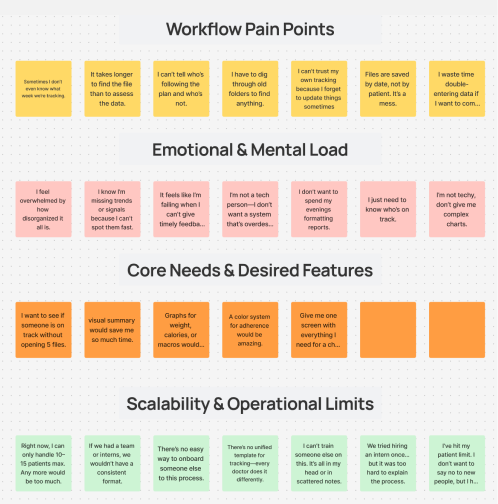
Selfcare had no existing brand. I designed a complete colour system from scratch — every token mapped to a purpose, every shade earning its place in the UI.

01 — Base palette
Orange #F97316
Primary / CTA
Orange Dark #EA580C
Hover / pressed
Orange Tint #FFF7ED
Active bg / selected row
Slate 800 #1E293B
Nav / dark surfaces
Slate 700 #334155
Headings
Slate 500 #64748B
Body text
Slate 400 #94A3B8
Placeholder / muted
Slate 200 #E2E8F0
Borders / dividers
Slate 100 #F1F5F9
Page background
Green #22C55E
Success / active
Red #EF4444
Alert / overdue
Amber #F59E0B
Warning / pending
Purple #8B5CF6
Accent stat
Blue #3B82F6
Info / links
02 — Design tokens
TokenValueUsed for
color.brand.primary #F97316 CTA buttons, active nav, key highlights
color.brand.hover #EA580C Button hover / pressed state
color.brand.surface #FFF7ED Selected row bg, active tab fill
color.surface.nav #1E293B Top nav bar background
color.surface.page #F1F5F9 Main page background
color.surface.card #FFFFFF Cards, panels, modals
color.text.heading #334155 Section headings, panel titles
color.text.body #64748B Body copy, table rows
color.text.muted #94A3B8 Timestamps, placeholders, secondary labels
color.border.default #E2E8F0 Card borders, table dividers, inputs
color.status.success #22C55E Completed, on-track, active patients
color.status.warning #F59E0B Pending, needs attention
color.status.danger #EF4444 Overdue, missed, critical alerts
color.accent.purple #8B5CF6 Secondary stat highlights (collections)
color.accent.blue #3B82F6 Links, info states, charts
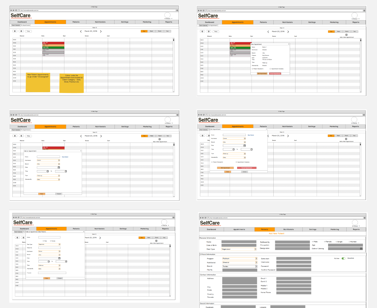
03 — Usage in context
Navigation bar
SelfCare
Dashboard Patients Appointments

Nav #1E293B · Active item #F97316

Stat cards
100
Active Patients
22
New Patients
10k
Collections
Calendar events
9:00 Monthly check up
11:00 Meeting with vendor
1 PM Missed appointment
Status badges
Active Pending Overdue Scheduled Review
100,000 outstanding collections
15 missed appointments this week
04 — Visual hierarchy
Primary The one action that matters most on the screen Add Task
Structure Navigation shell — always present, never distracting Nav bar
Heading Section titles, panel labels, patient names My Appointments
Body Table rows, descriptions, form values Call entry…
Muted Timestamps, secondary metadata, placeholders 5 days ago
Success Completed actions, on-track patients, active status Active
Warning Pending review, approaching deadlines Pending
Danger Overdue, missed appointments, critical flags Overdue
05 — Rules
Do
Use orange only for the single primary CTA per screen
Pair status colors with a tinted background (e.g. green text on #DCFCE7)
Keep the nav always #1E293B — never tint it with brand orange
Use #F1F5F9 page bg to lift white cards off the surface
Reserve red exclusively for errors, overdue, and missed states
Don't
Don't use orange for decorative purposes — it signals action
Don't put coloured text directly on white without a tinted bg
Don't use more than 2 accent colors in a single card or row
Don't use purple or blue for status — they carry no semantic weight
Don't use #64748B for headings — use #334155 to maintain hierarchy
Research Methods
1-on-1 interviews with 3 practicing doctors
Shadowing intake & reporting processes
File organisation system audit
Spreadsheet and tracker review
Competitive tool analysis
Design System Deliverables
Logo and brand mark with usage guidelines
Full component library for scalability
Colour and typography tokens
High-fidelity mockups for dev handoff
Style guide and spacing system

Messy folders.
Sleek, scalable platform.

6wk
From kickoff to first usable version
40%
Reduction in doctor review time per patient
100%
Doctor adoption within 2 weeks of rollout
0→1
Full brand identity created from nothing
1
Unified design system handed off to dev
Scalable foundation for patient-side features

"Selfcare went from a team buried in paper to a practice with a professional, scalable platform — designed for the real-world demands of nutrition-based healthcare."