Flexiloans wanted to make loan applications feel effortless. The existing process was long, confusing, and built around the lender — not the borrower. I redesigned the mobile experience to put approval in the user's hands, not in their way.
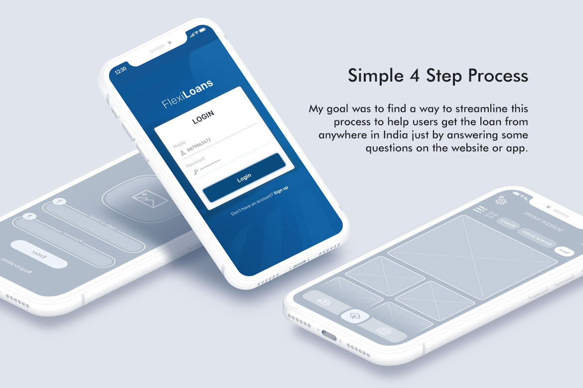
Getting a loan in India traditionally meant paperwork, branch visits, waiting days for a decision, and still not knowing why you were approved or declined. Flexiloans was built on a different premise — that credit should be fast, transparent, and accessible from wherever you are.
My brief was to redesign the mobile application experience to match that vision. The existing flow had too many steps, unclear progress, and an interface that felt designed for the lender's process rather than the borrower's confidence. The objective was to reduce the application to four clear, sequential steps — and make every screen feel like progress, not friction.
This meant rethinking not just the visual design but the information architecture, the language, the feedback states, and the moments where users were most likely to drop off and why.
Before redesigning anything, I needed to understand why people were dropping off. The answer wasn't one thing — it was a pattern of small failures across every screen that compounded into a feeling of distrust and effort.
The application felt like a single endless form. Users couldn't tell how far along they were, how much was left, or whether their inputs had been saved. Without visible progress, every screen felt like starting over.
Terms like "disbursement account", "tenure selection", and "KYC verification" appeared without explanation. For a first-time borrower, the language signalled complexity and risk rather than simplicity and speed.
Personal details, business information, financial history, and document uploads were all grouped on a small number of long screens. The cognitive load of each screen was too high to complete in one sitting on a mobile device.
Submitting financial documents and personal information are moments of high anxiety for users. The old flow provided no feedback, no confirmation, and no explanation of what happened next — leaving users uncertain whether their submission had worked at all.
The core design decision was to collapse the entire application into exactly four named steps — each with a single clear purpose, visible progress, and a moment of confirmation before moving forward. Complexity didn't disappear; it was sequenced.
A persistent step indicator at the top of every screen shows users exactly where they are and how far they have to go. Progress is cumulative — completed steps are checked, the active step is highlighted, and upcoming steps are visible but inactive.
The loan selection screen is where most financial apps lose users — the numbers are abstract, the commitment feels large, and the interface rarely helps. The redesign made repayment tangible and the confirmation state unambiguous.
"Financial Access at a Click" can only be true if the click leads somewhere that feels worth completing. The redesign was built around one question: at every screen, does this feel like progress or friction?