yesweed

HOW MIGHT YOU
BUILD A PLATFORM THAT ATTRACTS VENDORS, CUSTOMERS, AND A GROWING INDUSTRY NICHE?

Yesweed | Strategy | UX | Project Management

Why wasn’t there a go-to digital marketplace for cannabis delivery services?

When I joined the Yesweed project, the cannabis industry was missing a centralized, user-friendly platform for both customers and vendors - especially for delivery-based market businesses. I started as a UI/UX Designer, and soon took over as Project Manager, guiding the product from an ambitious concept into a functioning platform with real traction in a crowded and poorly-served market.

This wasn’t just about design - it was about building trust, utility, and simplicity into a high-stigma industry with legal constraints and limited user trust. With each iteration, we uncovered new ways to retain users, onboard vendors faster, and simplify order reservations resulting in an MVP that hit product-market fit faster than projected.

MY ROLE

I wore two hats: Design Lead and Project Manager.
  • As Design Lead, I architected the UX from scratch, focusing on conversion and simplicity.
  • As PM, I hired and managed a cross-functional team of developers, content writers, and graphic designers across time zones.
  • I conducted usability testing, drove platform strategy, and helped translate fuzzy startup goals into focused, measurable outcomes.
Strategy and discovery

STRATEGY & DISCOVERY

User research, industry analysis, competitive audit

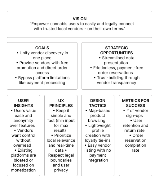
From the beginning, the goal was clear: connect cannabis users with local vendors easily and legally, despite industry restrictions.

We began with 3 hypotheses:

  1. Customers want all vendor options in one place.
  2. Vendors want free promotion and direct orders without the hassle of payment processing.
  3. Both groups are underserved by platforms like Weedmaps post-IPO.

We ran competitive audits across e‑commerce and marketplace models—not just cannabis‑focused—to understand key usability flows like:

  • Location-based deal search
  • Product discovery via list vs. map
  • Incentivized profile building through loyalty programs

The research pointed to one major opportunity: streamlined data display and ultra‑easy order reservation, without payments.
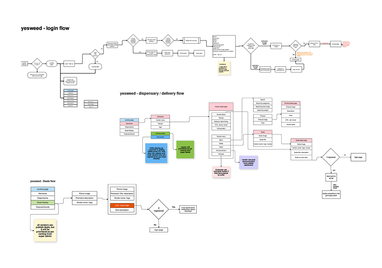
user flow

MVP LAUNCH + ITERATION 1

Goal: Get users browsing and reserving orders with minimal friction.

What we launched:

  • Vendor directory sorted by proximity and deal value
  • Order reservation flow via email
  • Block-based homepage with multiple discovery patterns (by deal, vendor, product)

Challenge: Too much info on the homepage led to drop-offs after 1–2 sections.

Result: MVP adoption was promising, but drop-off after first scroll showed information overload. Next move: Simplify content architecture.

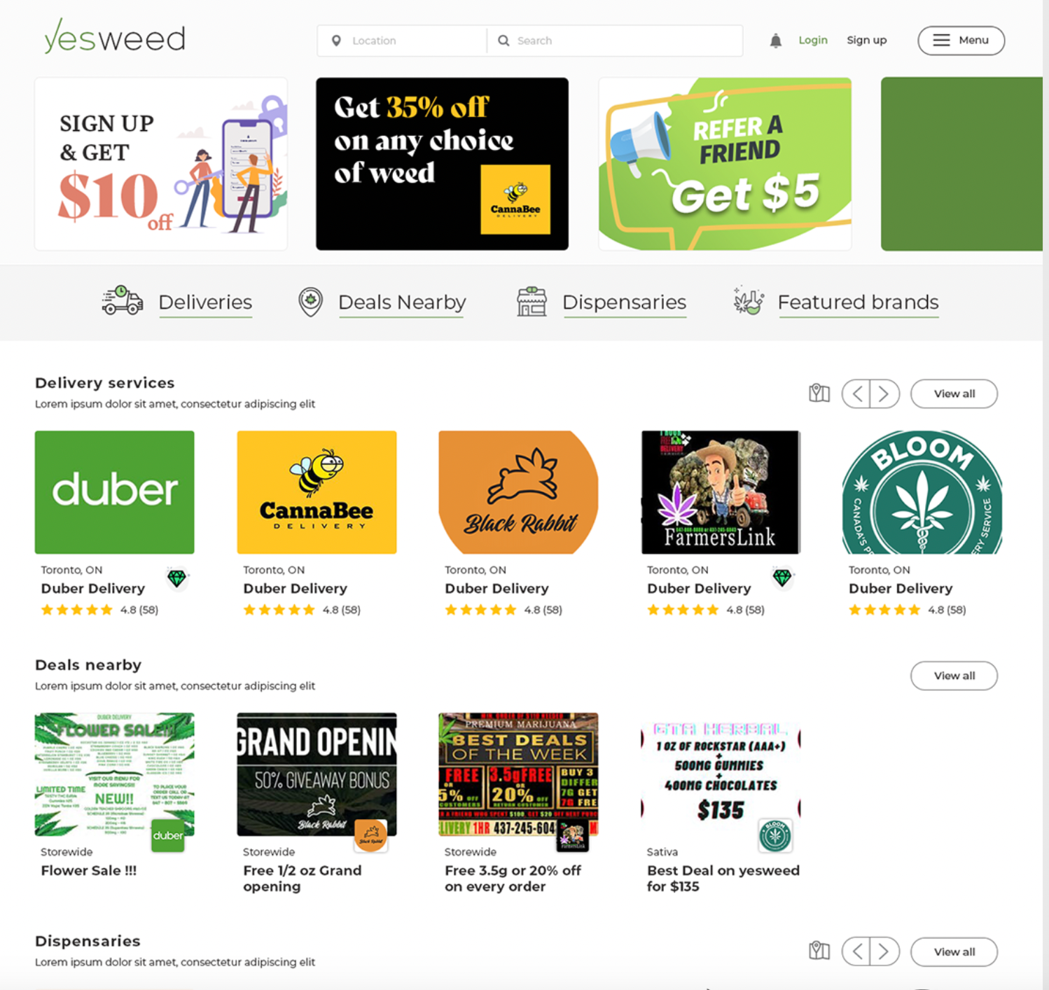
banner promo
yw homepage

ITERATION 2 — CLARIFYING THE VALUE

Hypothesis: Users need clearer segmentation between vendor discovery, deals, and reward programs.

What changed:

  • Tabbed homepage structure
  • Contextual callouts for loyalty/reward system
  • Simplified “List or Map” toggle to support different search habits

We also began onboarding vendors via a simplified intake form.

Result:

  • Bounce rate dropped by 21%
  • 32% increase in completed order reservations
  • Vendor onboarding time dropped by 40%

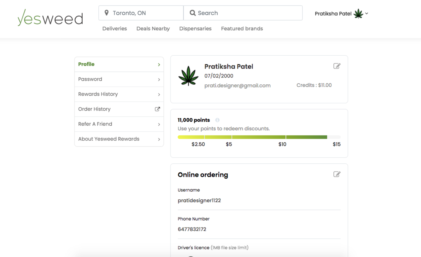
ITERATION 3 — STICKY USERS THROUGH REWARDS

Hypothesis: Gamification via rewards and profile completion will increase retention.

What we launched:

  • Reward Points for profile completion, order frequency, and referrals
  • Email reminders for point redemption
  • Vendor-specific loyalty perks (opt-in)

Result:

  • 47% increase in return users within 30 days
  • 65% of active vendors opted into reward system
  • Avg. order per user jumped from 1.2 to 2.4 in 6 weeks
gamification
Promotion dashboard

ITERATION 4 — FROM PLATFORM TO PROMOTION ENGINE

Hypothesis: Vendors want more exposure and control over how they’re promoted.

What we launched:

  • Premium listings
  • Featured promo placements
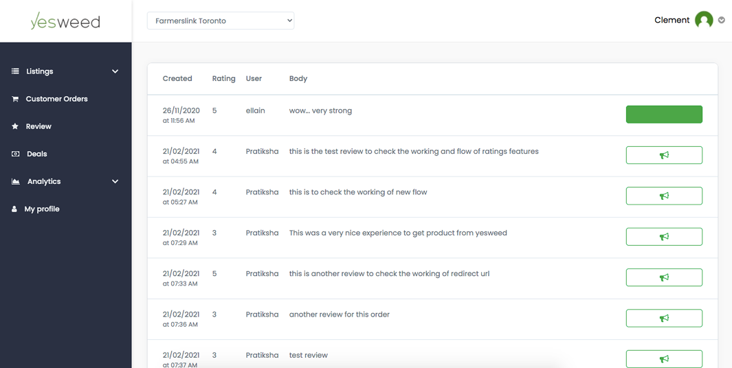
  • Vendor dashboard with listing analytics

We also began exploring A/B tests for homepage promo layouts, though limited budget meant smaller sample sizes.

Result:

  • Premium opt-in doubled within 3 weeks of launch
  • Vendor satisfaction survey showed 88% would recommend Yesweed to another vendor
  • Weekly user sessions increased by 38%

Results

This wasn’t just another vendor directory.

Yesweed became a sticky, scalable, and vendor-friendly platform in a highly nuanced industry.

  • Built and launched MVP in 4 months
  • Increased return users by 47%
  • Decreased vendor onboarding time by 40%
  • Achieved >30% increase in completed orders
  • Transformed homepage UX
  • Established revenue model