selfcare

HOW MIGHT YOU DIGITIZE A MANUAL HEALTH SYSTEM TO IMPROVE NUTRITION OUTCOMES FOR PATIENTS?

Selfcare | UX Strategy | Dashboard Design | Brand Identity

Why were doctors still tracking nutrition with folders and spreadsheets?

When I joined the Selfcare project, their team of doctors was manually managing patient health and food intake using document folders, printed charts, and scattered spreadsheets. It wasn’t just old-school, it was actively holding them back. Data was fragmented, insights were missed, and scalability was impossible.

My goal was to design a system that worked the way doctors think: simple, structured, and instantly insightful. This meant not only designing a clean and functional dashboard, but also building a full brand identity and scalable design system from scratch.

The result? A powerful-yet-lightweight platform that doctors could rely on daily without a learning curve or a mess of files.

MY ROLE

UX/UI Designer | Brand Strategist | System Thinker

  • Led UX design for the full dashboard experience
  • Conducted user interviews with Selfcare’s practicing doctors
  • Mapped workflows from offline chaos to digital clarity
  • Developed brand identity including logo, color palette, typography
  • Created high-fidelity mockups and a full style guide for dev handoff
Strategy and discovery

STRATEGY & DISCOVERY

User research, analog process audits, system architecture

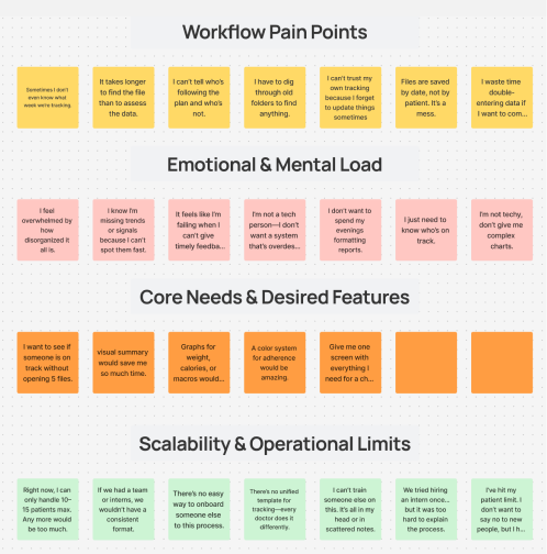
We started with a question:
“What’s actually slowing doctors down?”

I spent the first week deep in their world:

  1. Shadowed daily workflows and folder sorting rituals
  2. Reviewed Excel trackers and patient health notes
  3. Conducted interviews to uncover pain points and wishlists

Top insights:

  • Patient data was everywhere and nowhere centralized
  • Doctors had no quick way to visualize progress
  • Most digital tools felt “too complicated” or bloated
  • A simple dashboard with logs, summaries, and trends would save hours per week

Armed with this, I mapped the product strategy around clarity, consistency, and zero-friction workflows.

user flow

THE SOLUTION

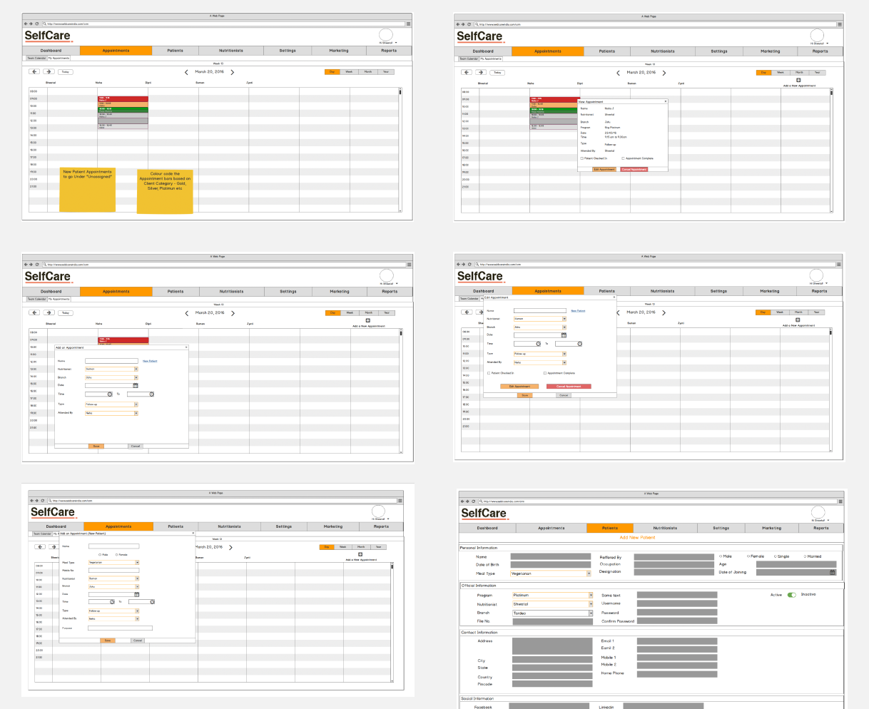
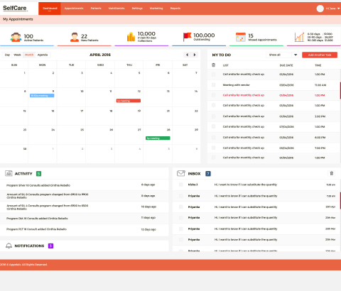
A clean, structured, insight-driven dashboard experience

Here’s what I designed:

Patient Overview Panel
At-a-glance data including:

  • Patient details and progress snapshot
  • Weight, goals, adherence status
  • Quick notes section for doctor observations

Daily Intake Tracker

  • Calendar view for food logs
  • Editable entries with meal tags and doctor comments
  • Visual alerts for dietary compliance (Green/Yellow/Red)

Analytics & Progress

  • Graphs for weight trends, calorie balance, and macronutrient tracking
  • Comparison view for goal vs. actual performance
  • Doctor recommendations surfaced contextually

Brand Identity & UI Kit
Since Selfcare had no existing branding, I created:

  • Logo with a wellness-oriented emblem
  • Readable typography for quick scanning
  • A full component library and design system for scalability
  • Studying existing tools for inspiration

Research Methods:

  • 1-on-1 interviews with 3 practicing doctors
  • Shadowing their intake & reporting process
  • Reviewing file organization systems and spreadsheets
  • Studying existing tools for inspiration

Results

Selfcare transitioned from messy folders to a sleek, scalable platform designed for the real-world demands of nutrition-based healthcare.

  • Launched first usable version in 6 weeks
  • Reduced doctor review time per patient by 40%
  • Created a full brand identity and design system from scratch
  • Increased daily usage by all active doctors within 2 weeks of rollout
  • Built a scalable product foundation ready for future patient-side features